
AIGA vote project
•April 16, 2008 • Leave a Comment
When the project started our clients Lisa and Grant gave us the objective of encouraging AIGA members to vote and promote the AIGA as the official design authority of Chattanooga. Our first objective was to come up with names, tag lines and logos. Coming up with a name/phrase was an ongoing process in which our class brainstormed such ideas as : “Expression”, “100% Win”, “Voice Your Vote”, to name a few. We then pitched our ideas to Lisa and Grant and they did not choose any of our first round of ideas. After more brain storming we had two phrase which seemed to stick which were “100% Win” and “Volume Through Volume”. “100 % Win” was more of a comical approach to the idea and I made a few logos for it at first trying ideas like strength test and slot machine to take a different approach to the vote theme. We eventually stuck with “Volume through Volume” as our phrase. With “Volume Through Volume” we were saying the more people vote the more their voice will be heard. Once we had an idea to stick with our next step was creating the look. As a class we came up with many logos before and after”Volume Through Volume”. Many of us had the idea of something that showed noise volume like the megaphone or microphone I tried one with a speaker as well. We showed Grant our logos and posted them on Base Camp. We received an email later from our clients showing some of the logos that were on the right track but not quite resolved yet and that they were looking for more of a logotype. The next time we met with Lisa and Grant our new logos were reviewed and a logo by Nekita was chosen after Lisa drew an outline around it to make the logo look like a mouth. Once the logo was chosen we had to think of ways to spread the word. We choose to use buttons and posters as our main advertising. The last step in our process was using the logo and creating posters and buttons. My poster ideas as going to focus mostly on the mouth and number of mouths to really stress the message of voice through numbers.
Visiting artists Mark Andreas, [dNASAb], and Ryan Wolfe
•February 21, 2008 • Leave a Comment
When the artists Mark Andreas, [dNASAb], and Ryan Wolfe came to UTC they had a very impressive exhibition in our art gallery. It was also very nice of them to visit our class and talk too us. Mark Andreas talked about a lot of things but what I found most interesting about him was all the not art disciplines he had to learn to build his sculptures. I also found the conversation about day dreaming very uplifting. I find I get many great ideas from day dreaming and focusing on a project at hand. [dNASAb] had a lot of interesting things to say and after hearing him talk I understand his name a little more. I wasn’t quite sure what to think of his name at first but looking at his art and seeing what he does with things like i-pods turning assimilating them into his own creation. Ryan Wolfe had some very interesting projects as well especially the motion activated devices. I also found it very interesting that he still used Illustrator for some of his projects.
Chattanooga Times Free Press
•February 21, 2008 • Leave a CommentThe field trip to Chattanooga Times Free Press was a very memorable experience. On the tour the first thing that really caught my attention was the printing plates they used. The flexo plates are light sensitive but only by intense light which is very similar to some of the techniques used in my photo lithography class since we use solar plates for photo etching and so forth. The use of CMYK was also very evident and it really added to my perspective of how the illusion actually works; much like the works of the painter Renoir who painted in a impressionist style. Seeing the actual press was the most impressive sight of them all. Seeing how the colors where printed at different parts and seeing the paper run through; it was nothing short of amazing. It was also very interesting to hear that the inks they used were water based and dried so quickly.
RMG
•February 21, 2008 • Leave a Comment
The class trip to the RMG was quite an experience for me. I never knew any printers of this magnitude where in Chattanooga, but they do prints all over. On The tour the first machine I learned about was their most state of the art and was one of a kind with abilities most of their competition could not match. They also had two similar printing machines that were much older but still efficient enough to use which used offset lithography which uses blankets to apply pressure which we got too see them hang some of the blankets on the rails after use.The most impressive site on the trip was the digital printers which can print on almost anything. The ceiling lights had advertisements on them which were printed from their printer, there were several examples spread all over of advertisements and images the digital printer could print off. Watching the printer in action was also very impressive as it printed out an add on vinyl. The whole experience really opened my eyes. Before this trip my conception of what a major printing operation was like was a lot more limited considering my only printing recourses I have ever used were the ones on campus and Kinko’s.
word pairs (bright/dark)
•February 20, 2008 • Leave a CommentMy word pairs for this project where bright and dark. Through out the process I was really experimented with different ideas and eventually came up with the idea to take pictures based on “ideas”. By this I mean a person can have a bright idea or a darkone. In this case I was trying to show two different points of view regarding what happens after death. For my first picture set which focused on the word bright I choose a translucent glass cross. The color’s I choose throughout the process are meant to give this subject an ethereal look to make the piece look more in touch with a spiritual after life. I also wanted colors that would make the viewer feel happy and positive. For the word dark the subject matter was different but very fitting. The media for this second set included dead roaches and an apple core. These were chosen to symbolize death and decay and that there is nothing after death just oblivion. Roaches were chosen because they are nasty and disgusting and they hide behind your walls and in dark places. I placed an apple in the mix to emphasize waste and decay but also to strengthen the effect of the roaches since it’s the remains of food. When I see roaches near any food it just has a very negative feel. The roaches are dead and for them there is nothing other than death.
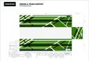
Freitag Design a Truck contest
•January 24, 2008 • Leave a Comment
Freitag has produced a contest in which you design a tarp for a truck. My idea for the contests theme of Transit is to create a design that conveys this theme without using any text to place emphasis. My design uses three colors to create layers in the composition white lines going under and over black ones with a green background. I modeled the design to resemble an overhead view of a highway or interstate which I feel is a good visual representation for Transit.The nature of my composition has a very geometric negative space which I arranged so that the tarp would make a good hand bags after it is cut up.
Hello world!
•January 10, 2008 • Leave a CommentWelcome to WordPress.com. This is your first post. Edit or delete it and start blogging!
